

CSS Grid is a grid-based system, with rows and columns, allowing placement of elements in a webpage without using floats and positioning.
Grid is 2-dimensional grid based system. Tables, floats, positioning all had some hacks and some functionality which cannot be met. Though flexbox was a great tool to use, but this was a one-dimensional one.
To make an HTML element a grid, we need to set display property to grid or inline-grid.
ex: display:grid
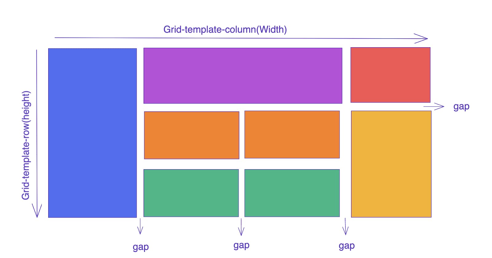
To set the rows and columns, we use grid-template-rows and grid-template-columns. To have the spacing between items, we use gap property and to be more specific regarding which gap, we use row-gap or column-gap accordingly.
The property grid is directly applied to the parent of all grid items.
Flexible Grids
Flexible grids use fr unit. In addition to px and percentage, fr unit is used. fr refers to one fraction of the available space in the grid container.
The fr unit distributes space proportionally and we can specify any positive values.
The first track gets 2fr of the available space and the other two tracks get 1fr, making the first track larger. In this case, the space needed for the fixed tracks is used up first before the remaining space is distributed to the other tracks.
Gaps between tracks
To create gaps between tracks, we use the properties:
column-gap for gaps between columns
row-gap for gaps between rows
gap is used as shorthand for both
Grid with some gaps
Placement of elements in grid
Following are the properties used for placing the elements on the webpage.
grid-column-start
grid-column-end
grid-row-start
grid-row-end
These properties can all have a line number as their value. You can also use the shorthand properties:
grid-column
grid-row

Justify Content
Values:
start – aligns the grid to the start edge of the grid container
end – aligns the grid to the end edge of the grid container
-
center – aligns the grid in the centre of the grid container
stretch – resizes the grid items to allow the grid to fill the full width of the grid container
space-around – places an even amount of space between each grid item, with half-sized spaces on the far ends
space-between – places an even amount of space between each grid item, with no space at the far ends
space-evenly – places an even amount of space between each grid item, including the far ends
Align Content
Values:
start – aligns the grid to be flush with the start edge of the grid container
end – aligns the grid to be flush with the end edge of the grid container
center – aligns the grid in the center of the grid container
stretch – resizes the grid items to allow the grid to fill the full height of the grid container
space-around – places an even amount of space between each grid item, with half-sized spaces on the far ends
space-between – places an even amount of space between each grid item, with no space at the far ends
space-evenly – places an even amount of space between each grid item, includes the far ends