

Flexbox also referred to as Flex Box Model, is a one-dimensional layout, which provides magnificent alignment options. One-dimensional means, it targets one direction at a time aka either a row or a column, one at a time.
Why Flexbox?
When we have CSS properties like positioning and floats, why do we need flexbox? Yes, I agree three two properties satisfy the need to place the items on a webpage, but it is a tedious one with a lot of CSS values to be added and is limiting as well.
In situations like using where we need to set flexible width/height, horizontally/vertically centring, flexbox comes handy. Let us understand some of the properties of flex with code samples.
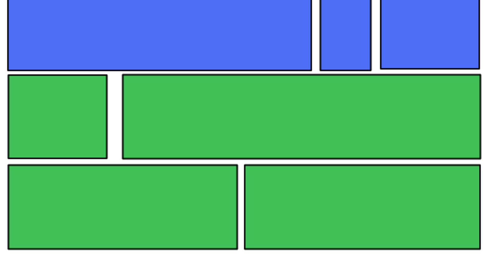
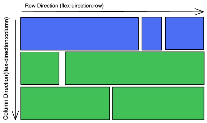
The Two axes of Flexbox.
Main Axis - Is defined by flex-direction property.
Cross Axis - This runs perpendicular to the main axis.
Main Axis properties: row, row-reverse, column, column-reverse.
Getting started with using Flex.
We use the property as, to start with flex.
display: flex
Code Sample
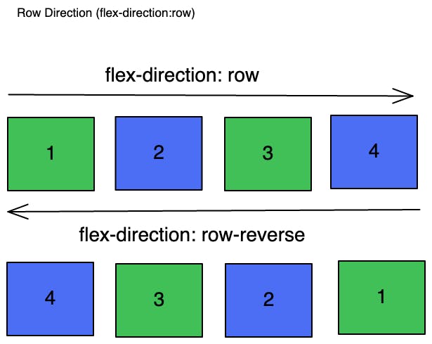
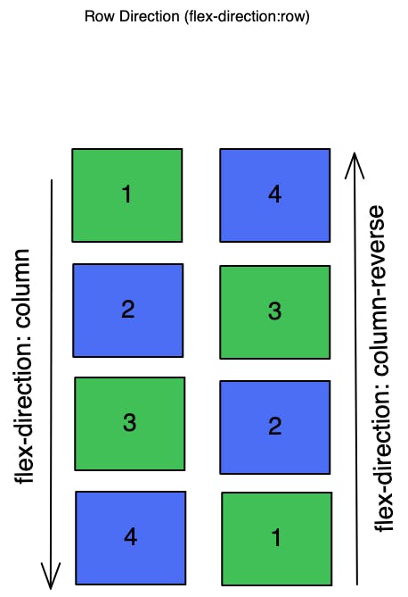
Flex-Direction
Using the flex-direction property we can change the direction of the items to display. Flex-direction includes values:
row: the display of items in a row pattern
row-reverse: the display of items in a row pattern but switches the direction of the items to be displayed.
column: the display of items in a column pattern
column-reverse: the display of items in a column pattern but switches the direction of items to display.
row and row-reverse: Code Sample
column and column-reverse: Code Sample
Flex-Wrap
To wrap flex items we use the flex-wrap property. It wraps the items into multiple lines.
No-wrap: Default value of flex, which doesn't need flex items to wrap to the next line, by decreasing the width of each flex item to align them in a single line or row.
Wrap: Wraps items to the next line, as the width of the container, is 400px in the below code.
Wrap-reverse: Wraps flex items to the next line along with reversing the order to be displayed.
Flex-Flow
This is a shorthand for flex-direction and flex-wrap. Combining the values of these two properties as in like row wrap, column wrap, row-reverse wrap, column-reverse wrap.
row wrap: Code Sample
row-reverse wrap: Code Sample
row wrap-reverse: Code Sample
row-reverse wrap-reverse: Code Sample
column wrap: Code Sample
column-reverse wrap: Code Sample
column-reverse wrap-reverse: Code Sample
column wrap-reverse: Code Sample
Flex-Grow
The flex-grow property will allow the flex items to grow and takes a positive number. It allows accommodating the flex items based on the available space. If the value is set to 1 for all three items, all flex items will be assigned the same size and stretch with the available space.
flex-grow: 1
flex-grow:2
Here the third item is given flex-grow:2, so it assigns more width to it and aligns other items accordingly.
flex-grow:3
Alignment of flex-items
Justify Content: justify-content aligns the items along the row or column based on space availability on the main axis.
Values of justify-content are:
justify-content: flex-start - Moves the flex items to the start of the container. Same as justify-content: left and justify-content: start.
justify-content: flex-end - Moves the flex-items to the end of the container. Same as justify-content: right and justify-content: end.
justify-content: center - Aligns the flex-items to the center of the container.
justify-content: space-between - Creates a space between the flex-items, by placing the first item at the start and the last item at the end. Later aligning the other items accordingly to the space available.
justify-content: space-evenly - Creates an equal space between the flex-items.
justify-content: space-around - Creates space between flex-items considering the spaces before, between and after the items.