

Table of contents
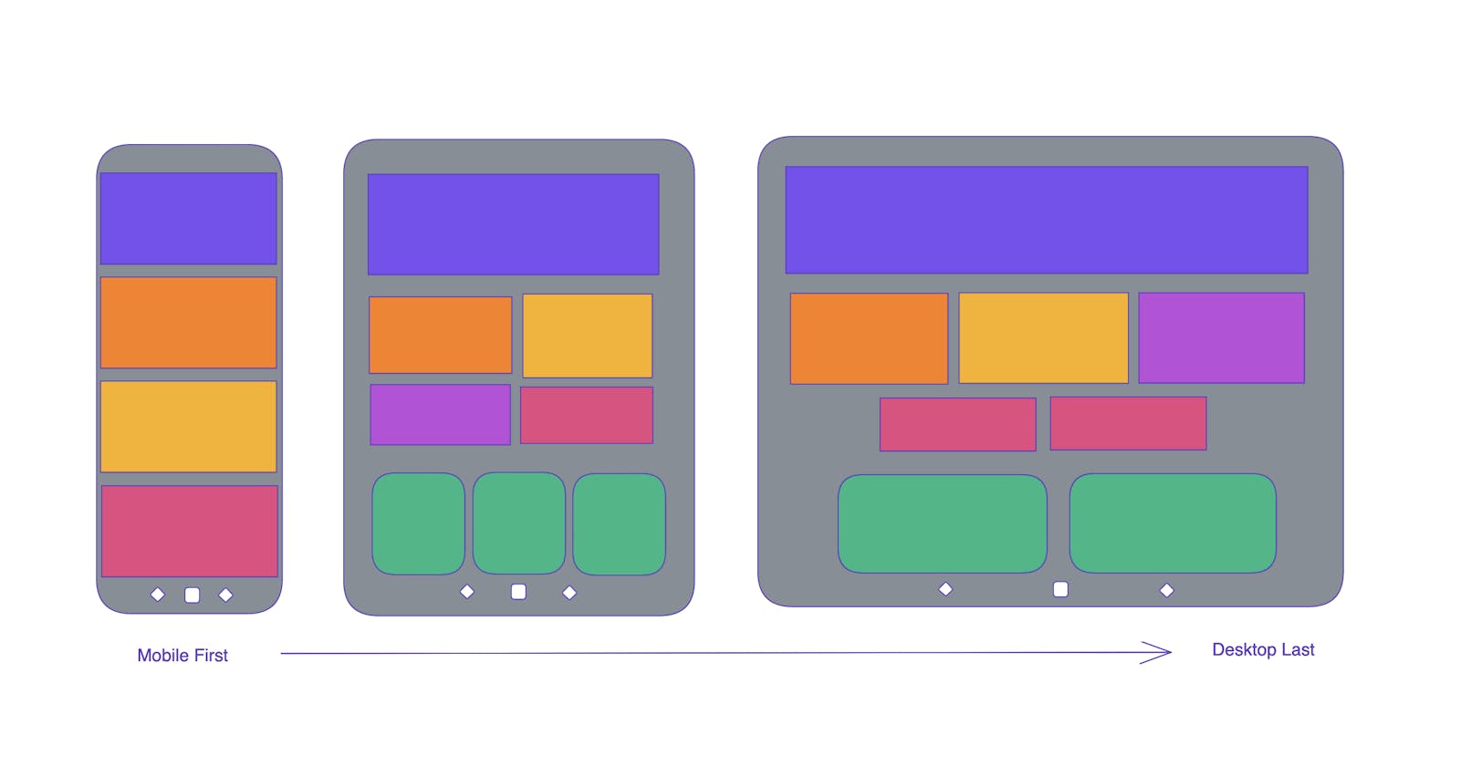
CSS Media Queries allows us to target websites on various devices ranging in size from mobile to other screen widths, be it desktops with large monitors, mid-sized laptops, tablets, or smartphones.
For optimal user experience, we need to make sure our websites adjust their layout across the screens by resizing, hiding, shrinking, enlarging or moving the content accordingly. This is called Responsive Web Design(RWD)
Media types first appeared in HTML 4 and CSS 2.1. This enabled writing separate CSS to make the website adjust for different screen sizes. Following are the responsive values used often:
320px
480px
600px
768px
900px
1024px
1200px
However, there is no defined page width to target. But above mentioned values are the most frequently used.
Syntax of media query
@media not|only media type and (expressions) { CSS-Code;}
Media query consists of the media type and contains one or more expressions, which checks whether it is true or false. If the condition is true, the styles are applied else the styles are not applied.
With the “not” and “only” operators we can play to group or exclude a particular type of media type.
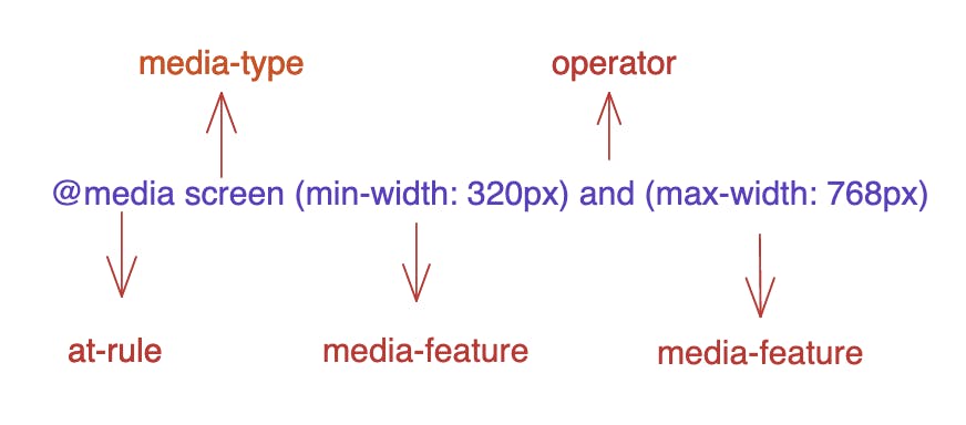
The media type specifies what we are targeting. There are four media types that can be targeted:
all: Matches all devices
print: Matches documents that are viewed in a print preview
screen: Matches devices with a screen
speech: Matches devices that read the content audibly, such as a screen reader.
The media feature sets the condition to meet the output device specified above for the condition to be true and applies this code contained in our media query. We basically would have used max-width, and min-width very often but there are other features too for the media feature like:
width: defines width of the viewport( this can min-width, max-width or specific number like 990px)
height: defines height of the viewport(min-height, max-height or specific number like 990px)
aspect-ratio: Defines the width-to-height aspect ratio of the viewport
orientation: such as tall (portrait) or wide (landscape) based on how the device is rotated, based on the way the screen is oriented
The operators are used to check certain conditions for the logic to be applied. Different operators used are:
- and: used to target screens in the range specified
/* Matches screen between 320px AND 768px */
@media screen (min-width:360px) and (max-width: 768px) {
.element {
    /* Styles! */
  }
}
or (comma-separated): used to target any of the one given condition
  /*
    Matches screens where either the user prefers dark mode or the screen is at least 1200px wide */
  @media screen (prefers-color-scheme: dark), (min-width 1200px) {
    .element {
      /* Styles! */
    }
  }
Code Samples
        body {
            background-color:blue;
        }

        @media screen and (min-width: 480px) {
          body {
            background-color: teal;
          }
        }
the above example changes the background colour of the body to teal if the viewport width is 480px or wider, else the background colour will be blue.
Media query 4 provides a simpler syntax using greater than(>), less than (<)and assignment operator(=).
@media (min-width: 360px) and (max-width: 990px) {
  body {
    background-color: teal;
  }
}
/* Newer way */
@media (360px <= width <= 990px) {
   body {
    background-color: teal;
  }
}